J.G. Elmslie
Insider
OK, here's a series of notes on some of the stuff in-game. Range from the major, to trivial, based on my various attempts to get through to the end:
I've listed it as trivial little stuff - thoughts of "that could be better" first, with the bigger details and major points later on.
(1) Object: Hourglass.
There's one sitting on a shelf in one of the Level 1 rooms, and I was rather disappointed when I found I couldn't take it. If a compass shows which way north is, an hourglass would be a perfect way to show time passing. Is it daylight outside? Night-time? Have I been in the dungeon 3 hours, in real-time, or 3 days?
Mostly relevant later on, in SG, I expect. or if food/health is implemented in any way. But I think it would be a nice detail to compliment the compass, in giving the player feedback of a world outside the dungeon walls.
(2) UI: Equipment Dots:
It would be really, really nice (and really simple) if an object info box could automatically compare with an existing, worn object - if better, the extra dots (or half-dots) are illuminated. ie:
Wearing
Cloth tunic:
Coverage ◉◉◉◎◎
Slash ◉◎◎◎◎
and you click on
Leather Tunic:
Coverage ◉◉◉◎◎
Slash ◉◉◎◎◎
With a highlight when its something better than currently worn.
that would save so much hassle and faff... its little details like that that give a game polish, and compliment the gameplay without being intrusive.
(3) Inventory: Carried items
Clothing Item: Belt.
It strikes me as rather daft that a belt has a tiny bit of protection/coverage, but takes the same slot as an entire waistcoat/harness at the moment.
Currently, the carried items interface is rather poor, its often messy. I pity the pack-rat players who want to collect and hoard everything, trying to stuff it all in there, layers and layers of stuff. This will inevitably become a far bigger issue in SG, too.
So... What if a belt instead added a second, smaller, narrower inventory space, that small items can be put into, just below the current inventory area?
Now, to implement that and improve the gameplay with it, have that new inventory remain available without having to open the full inventory. Its just sits there unobtrusively in-game, in the bottom corner of the screen.
With such an area, you could use that for quick access to items - to tuck a key into your belt, or to have a healing vial to hand, or maybe later on, for a bandage or lock-picks, for example. Approach a door, and there's no fiddling with inventories to select the key - just a simple double-click on the inventory area, and then on the door, and the key which you had in your belt gets used.
In this way, the belt becomes a useful item to wear, it contributes to the immersion in-game without diving into the inventory for menial items. If you wanted, for gameplay purposes, you could keep it as the same slot as the waistcoat/harness type garments, like it is now, and you've got a perfect example of players having to make a choice - an extra layer of protection, or convenient access to tools and equipment.
(3b) Inventory: Carried item space
Following up from the belt, a few other observations about inventory space:
you're able to wear nothing but some underwear, yet run around with a mountain of stuff somehow stored in there. Impressive...
I feel it would greatly compliment the gameplay and inventory system, if no clothing at all meant a much smaller inventory - to represent just what you can fit in your hands (or stick down your braes, if you're that way inclined...). Once you have clothing on (which, hopefully should be almost immediate, then you can start to carry more, and the inventory box grows to its current size, representing your pockets, a simple belt on hose/doublet, etc.
The logical expansion of that association of clothing with inventory space, in turn, would be to implement several wearable items that can then expand carrying space further - the belt, already mentioned in point 3 creating a secondary space, or belts with pouches or a purse attached. Further expansion still could come in the form of an over-shoulder haversack, a leather back-pack, saddlebags, or a sturdy wicker and oak ruck-sack, each offering ever-greater volumes of storage space, represented by a larger inventory window. Each could expand the inventory space, it could also again serve as a player choice of gameplay style, by subtly penalising movement, particularly running speed. You can be loaded up with stuff, and move slower, or you can go light, and only have space to carry a limited amount of items.
In connection with that would be the potential for additional pockets or sections of bags to have different inventory tabs or boxes, allowing players the opportunity to self-regulate and organise their items, as they wish. They can say to themselves "ok, Books go in that part of the saddlebag, All my keys are on the belt, weapons go in the big section" for example. Such an expansion of the inventory system will benefit players and improve their gameplay experience, I believe.
(4) Object Mouse-over: Small items.
Now, it may just be me, using 1920x1280, but currently, picking up objects can be an absolute bitch. Even zooming in as far as possible, its often a hassle clicking dead on part of a key that's half hidden under a table. Could I suggest that when being selected, an enlarged hitbox on small objects that can be click-grabbed is implemented for really small items, the things that fit in one hand like keys, and will be even more important if jewellery or the likes is implemented.
Trying to click on something tiny, like a small golden ring with the current system, that might be just a few pixels in size? that's just going to be way too much hassle.
A slight halo effect on mouse-over, to show that the object has been selected would probably be useful, but only if its used only for mouse-over, so its not a game of "spot the glowing objects".
I dread to think what it must be like on low resolutions, using the current interface to grab objects.
Again, this is something where a small, minor polish of the system will improve the interaction greatly.
(5) Object Mouse-over: Click, rather than drag.
This is a very personal preference. I have severe RSI damage in my hands from when I used to work as a 3d modeller in the games industry. even now, years after I quit working full-time, mouse-dragging (leftclick down, drag, release) is incredibly painful if done for any duration. Likewise, the holding left-click for running/walking using the mouse.
I'm unable to play for long durations, simply because its too painful on damaged hands, doing that sort of action. a simple single-click select to "pick up" objects, move, and a second single-click to "put down" would make gameplay far less painful for me, or anyone with similar disability.
(5b) Redefine Keys
Please, make it possible to redefine all keys, including LMB/RMB - for reasons like I've already explained there.
(6) Mouse-over and UI: general objects
I personally feel the UI is extremely poor in some ways. with the X and » icons covering every action, it can be incredibly frustrating simply due to it being a sub-par implementation.
Is that a trunk that can be opened? no indication.
Can that object be picked up? no indication.
Is that a item I can interact with? No sign. and so on.
the UI could be vastly improved through the use of simple, subtle context-relevant icons - an eye or similar graphic design icon for an action to look in a closed chest, or at a book, a hand closing "pinch" icon to indicate objects that can be manipulated, an open hand to indicate items are too heavy, and so on.
Simple additions like that would greatly enhance the general interactivity of the gameplay, and improve the UI greatly. Such controls would rapidly allow the player to work out if something can be done, or not, without needing to constantly be clicking away, unsure if an object is simply non-interactive, or if it has been interacted with in the wrong fashion.
(6b) UI & Audio integration:
Ideally, I'd like to see visual clues that appear alongside foley effects for some elements of UI Mouse-over - for instance, the icon turning to a keyhole, or a padlock symbol beside a locked door or chest, when its clicked on gives a visual indicator as well as the audio feedback.
Currently, Foley work is weak in the game as a whole. the music is good, but ambient audio sometimes could be better, and little details like visual feedback would help complement the sound work already in place. Improving the UI's communication through the use of good, clean graphic design elements like this would serve to greatly benefit the game as a whole, and make interaction more intuitive.
(7) UI: Graphic design and Art Palette:
Grey. More Grey. Yet more Grey. 50 shades of f***ing grey...
(Ok, now I'm starting to get into the bigger details that strike me about the design, and this is rather defined by my experiences as a designer and art director, and the way I feel there are elements in need of a lot of work. I hope it makes sense to anyone who's not quite so heavily experienced in design.)
Frankly, its dull. Particularly given the general AD, palette and style chosen for the level design, Exanima is spectacularly underwhelming. It makes Morrowind look vibrant, and that's not a compliment. The engine's lighting potential is plain to see for anyone who's worked with colour palettes, and it is screaming to be exploited. At the moment, that is one of the biggest failings of Exanima - in many ways, more than the drunk motion control, it is the incredibly restricted palette of the graphic design for the game that is a wasted opportunity.
I believe that the overall AD for Exanima as it currently is, is detrimental to the game, and I believe that that will drive customers away. There are points where, even with a torch, I find myself having to increase brightness and contrast on my monitor to see much at all. Combine that with tiny objects like keys, with no hints as to their locations, and you have a miserable experience at times.
Now, much of that can be argued to be the setting. And I agree, the setting should have plenty of darkness. But what I would love to see is a lot more in the way of flashes of colour, moments of light. Create contrasts, create brighter areas, that form a visual juxtaposition, use the engine to its full potential, and create something that can go from looking good, to looking beautiful.
Nowadays, I work as a historian, and study medieval history, arms and armour, and the cultural artefacts of the medieval age. In my work, I've handled countless objects from the medieval age - from parts of harnesses of 15th century plate and 12th century swords, to Viking seaxes, and 16th century textiles. And what strikes you as you study these objects is that even though they might be 500, 600, even 1000 years old, the decoration shines through.
Our ancestors did not live in a monochromatic world of grey and brown, and reflecting that could make Exanima - and particularly SG leap out. Part of that has already been touched on - we have riot of colours in some of the clothing (Ironically given I'm criticising the general palette of being too grey, I'd argue that the textiles in-game are is sometimes slightly too over-saturated - leather harnesses in bright cyan, vivid purple or acid green jar my eyes, as they're modern aniline dye products, rather than pre-Industrial revolution dyes. The Devil is in the details... Also, there's too much velvet. That was a rare, luxury fabric, hard to make. I personally would prefer to see "velvet" replaced with cotton, or linen.), but what I would argue for is that the world itself needs colour too, to come to life. Wooden tables should be greying on chipped corners, yes. But the rest of the table? Those should be painted in bright vivid reds and blues, burnt sienna yellows. Chests, decorated in Green and White, bands of iron painted with a red lead-based paint. Walls shouldn't be monotonous dead, grey ashlar, but white-washed with lime, bright white stonework. And of course, you will get plain stuff too - but having bright stuff will allow the development of colour palettes, and help overcome the current monotony of brown and grey. It will allow the improvement of the environment as a whole.
We see medieval castles and churches as grey stone. they were so far removed from that! That's like looking at a dinosaur in a museum, and saying that all dinosaurs were black stony bone, walking around with no flesh. We have always decorated our surroundings, and medieval - or medieval-inspired fantasy - should be no different to that. And those flashes of colour will be what makes the world come alive.
In a later iteration of Exanima with art asset tweaks, and particularly in SG, what I'd like to see is the AD take a much more daring willingness to use colour - pottery on shelves not of mud-brown, but of bone-white, with glossy copper-green glazes on the tops of mugs. Tapestries on the walls. Bright ochre and blue-glaze tiles on floors, whitewashed walls, chairs and trestle tables painted red and blue. I'd like to see the creation of environment models depicting shafts cut into the ceilings of chambers, bright light streaming down forming Crepuscular rays (AKA God's Fingers) in the dusty gloom - it doesn't need volumetric lighting in the engine to be able to easily fake the effect in the environment. Make the place come alive with colour, to contrast those darkest areas, and it will enhance the ambience of the setting greatly. The game will benefit, it will no longer feel dreary, and it will entice players forward. and that can be used to also make areas darker, more forbidding, and in turn, make the settings more atmospheric.
At the moment, the lighting system feels badly under-exploited. You have a real gem of a game engine, that you could use to really play to its strengths - and currently, its being wasted in Exanima.
Your art director, and conceptual artists need, to be blunt, a shot in the arm, to have the willingness and the conviction to push the boundaries of the setting, instead of timidly repeating the same dull tropes. What you have has great potential.
(7b) Dynamic lighting:Object: Candlestick
Object: Fireplace
New Object: Flint and steel?
New Object: Lantern
New Object: Lantern Shield
I would love to see the ability to manipulate the environment's lighting become something that the player can do, following everything that's been said about colour palettes and adding life to the environment art in-game.
Imagine lighting up torches which were left on the wall, or to set a fire burning in the fireplace (with appropriate foley effects for the ambient noise of course), and to use a flint and steel inventory item, or a burning torch to light the candles, and for a dark, dismal area to be filled with light, the colour palette to start to shift from cold blues to warm oranges, and for a place to start to feel safe.
That's the sort of game play that lets players explore and change their environment, and also becomes a reward element.
Ideally, I'd like to see a flint and steel in-game that can create fire for that purpose - it becomes one of those items which the player will cling to, something that keeps back the darkness.
Even better would be for light to be able to become a weapon - by it driving creatures back, making them more hesitant if they break into a now brightly-lit area, and in that way, giving the player not just the sense of security, but also opening up tactical options for combat, to draw an opponent into the light, disorienting them, and giving the advantage to the player. Better still from an environment art point of view, that lets you further emphasise the threat and desolation of the unexplored and hostile areas of the game environment, to the safe and secure.
Ideally, for game elements, I would also love to see the creation of a Lantern Shield object - particularly appropriate in more renaissance-styled elements of the setting (the redhead with sword and shield in the arena makes me think of the renaissance era rondelero duellists, and for that sort of style, the lantern shield would fit right in) - and as this surviving example shows, its exactly what the name suggests - a shield with built-in lantern - perfect for exploring darkened places. (their original purpose was for watchmen in cities at night.)

Also, returning for a moment to point 7 on colour and overall art direction of the palette, note the decoration!
If that's not screaming to be used to light the darkness, and to dazzle and disorient the creatures down there, what is?
(8) Navigation
While the compass helps, its still far, far too easy to get lost in-game, or to find yourself going in a circle. it can be rather fun taking it very, very slow, and carefully drawing out every single room, mapping where the doors are, which way they open, annotating it all onto a huge sheet of paper on the table beside me. That is definitely not most people's idea of fun, however. What's needed is some sort of mapping system, that will reveal a map. (ideally, eventually, I'd hope that we have the inventory, a journal, and maps at the least.)
I'm inclined to suggest that the map requires the player to find blank paper, and charcoal.
I'd also suggest that areas of levels should have maps already drawn, for the player to find and to enlarge their existing maps through such finds.
Ideally, I'd like to see those represented a fairly simple line drawings in-game, not some perfect virtual overlay like many games do - just enough to let the player follow the twists and turns, but not marking enough that its leading them by the hand - doing so gives players incentives to make their own maps, if they want to, but also means they at least have something pre-generated by them.
What's badly needed in this regard are more unique landmarks in the way of art assets - the table with a map spread out on it in the second level, the exit from a corridor to find a large open space with archways, with two antechambers on each side, in the first level. Things like that become distinctive points of navigation that are recognised, and should be encouraged, with more details like floor mosaics, rarely used, distinctive set-dressing, and similar art assets, or strong lighting areas.
Its very easy to get confused if this is badly lit Corridor A, or Badly lit Corridor F.
One thing I'd love to see there for navigation is chalk, and the ability to make a mark (simple transparency layer placed on the ground) with an arrow or the likes. The other thing for navigation I've never seen in a game is a ball of string.... tie it to a point, and you get a bright line of string overlays over the tiles between your start point and your current position, up to a certain length - 100 paces (about 20 small cube rooms long) or something.
9: UI graphic design
I personally feel that with the overall palette of the environment, the general UI scheme needs a lot of work. The grey, square-edged boxes of the inventory, the colour scheme of the intro pages and character creation are horribly unsuited to the style of the game, and they contribute to dragging the game down into the doldrums.
Exanima and SG are meant to be a fantastical, somewhat medieval world, but the interface doesn't say that at all. It feels like the interface I'd expect to see in a cold, post-modern cyberpunk setting. Nothing about the user interface elements say "fantasy world" to me. there's no decoration, no details in the borders, no colours or texture that convey a language of visualisation to me. if its medieval, it screams out to have the character generation pages on either side of the avatar be in bright vellum, bordered with carved stonework - high pointed English Perpendicular tracery, or heavy Norman arches, Multicoloured red sandstone and white limestone chequers of Byzantine pillars, or painted polychrome wood. Not cold, square-edged grey Windows. And currently, for new customers, that first view of the character creation is their very first impression. and its not the fantasy world of vivid life and colour and vibrancy. Its the sterile grey of an accountant's office. And that first impression is dull. the screen is dark and gloomy, and there's nothing that hints of imagination in there. Its a marketing nightmare.
That desperately needs work, as does the inventory system, to start to create some sort of feel for the setting. The graphic design chosen there needs to have some sort of counterpoint to the current art direction's dearth of colour. And with Exanima now in public, for the Early Access, that absence of any flair or life to the UI is visible to the public as a whole. and its simply not good enough for that all-important first impression.
(9b) First impressions:
Tutorial, interaction etc.
There's dire need of a very basic tutorial at least, for the same reasons as the first impression of the overall graphic design of the UI - commentary I've read like "took 10 mins to open the first door" is commonplace, and its that sort of thing that will result in a lot of players quitting right away, and giving negative feedback to their friends, the sort of word-of-mouth impression that will scupper sales rapidly.
I personally feel that a number of guidelines need to be come up on-screen at the start of the game playthrough (you can have an option tickybox for "disable starting hints" for the ultra hardcore types), as subtle introductions.
Personally, I would be inclined to expand the opening room with the addition of another small anteroom that the player wakes up in, with the door ajar, the torch on the floor, and more importantly, a brighter light (a skylight, or similar) in the main room, the door out from the room locked, and a table or desk with a key on it, in the light. The light serves to stream through to the player through the open door, giving them a clear first direction to aim for.
That slightly open door is a quick, effective way to let the player see how the mouse-over action interacts with the door (and in turn, teaches the player instantly that the mouse-over interacts with other items). Because its a door that's a little open, even if they click and drag it the wrong way, and it gets pulled closed, they see that is moves, so they can figure out that it was pushed not pulled, and they can try the other way. This prevents the player from getting immediately lost, pushing on a door that only moves by pulling, and concluding that they're not doing any action.
The key on the table is well-lit, making it easy to spot. It teaches them that they need to look for detailed objects, as well as large items. the immediate access to a key and the only doorway for progress being locked, shows them how to use double-click and an action to do things like unlock doors.
And of course, its dark in the hallway, so they realise that they need light - so if they failed to collect the torch, its close enough to their start point that they should remember its there.
In that way, with a simple addition of a few elements, with a subtle series of guidance pointers that come up as items are collected along the path to opening that door, you've got the basic tutorial that serves to show players the fundamental control elements without it being intrusive. That's what's needed to give completely new players a very simple grounding in how the game works, and the core mechanics.
(10) Combat controls.
Kinematics in the body need so much work, that that's going to be a post far, far longer than this one.
but its the big first impression problem that I steel feel needs addressed in a constructive but critical way.
I honestly believe that there are ways to make combat much more direct and intuitive, without dumbing it down. I also am firmly of the opinion that as it is, it is both the best unique selling point of the game, and its biggest problem which will drive customers away. So I'll leave it at that and put that into a bigger post, later on. Someday. when the stars are right.
---
Erm. Ok, that was a longer post than I planned.
I hope some of those make sense for the important elements of design, first impressions, and generally, for improving the way the game can play, without compromising
I've listed it as trivial little stuff - thoughts of "that could be better" first, with the bigger details and major points later on.
(1) Object: Hourglass.
There's one sitting on a shelf in one of the Level 1 rooms, and I was rather disappointed when I found I couldn't take it. If a compass shows which way north is, an hourglass would be a perfect way to show time passing. Is it daylight outside? Night-time? Have I been in the dungeon 3 hours, in real-time, or 3 days?
Mostly relevant later on, in SG, I expect. or if food/health is implemented in any way. But I think it would be a nice detail to compliment the compass, in giving the player feedback of a world outside the dungeon walls.
(2) UI: Equipment Dots:
It would be really, really nice (and really simple) if an object info box could automatically compare with an existing, worn object - if better, the extra dots (or half-dots) are illuminated. ie:
Wearing
Cloth tunic:
Coverage ◉◉◉◎◎
Slash ◉◎◎◎◎
and you click on
Leather Tunic:
Coverage ◉◉◉◎◎
Slash ◉◉◎◎◎
With a highlight when its something better than currently worn.
that would save so much hassle and faff... its little details like that that give a game polish, and compliment the gameplay without being intrusive.
(3) Inventory: Carried items
Clothing Item: Belt.
It strikes me as rather daft that a belt has a tiny bit of protection/coverage, but takes the same slot as an entire waistcoat/harness at the moment.
Currently, the carried items interface is rather poor, its often messy. I pity the pack-rat players who want to collect and hoard everything, trying to stuff it all in there, layers and layers of stuff. This will inevitably become a far bigger issue in SG, too.
So... What if a belt instead added a second, smaller, narrower inventory space, that small items can be put into, just below the current inventory area?
Now, to implement that and improve the gameplay with it, have that new inventory remain available without having to open the full inventory. Its just sits there unobtrusively in-game, in the bottom corner of the screen.
With such an area, you could use that for quick access to items - to tuck a key into your belt, or to have a healing vial to hand, or maybe later on, for a bandage or lock-picks, for example. Approach a door, and there's no fiddling with inventories to select the key - just a simple double-click on the inventory area, and then on the door, and the key which you had in your belt gets used.
In this way, the belt becomes a useful item to wear, it contributes to the immersion in-game without diving into the inventory for menial items. If you wanted, for gameplay purposes, you could keep it as the same slot as the waistcoat/harness type garments, like it is now, and you've got a perfect example of players having to make a choice - an extra layer of protection, or convenient access to tools and equipment.
(3b) Inventory: Carried item space
Following up from the belt, a few other observations about inventory space:
you're able to wear nothing but some underwear, yet run around with a mountain of stuff somehow stored in there. Impressive...
I feel it would greatly compliment the gameplay and inventory system, if no clothing at all meant a much smaller inventory - to represent just what you can fit in your hands (or stick down your braes, if you're that way inclined...). Once you have clothing on (which, hopefully should be almost immediate, then you can start to carry more, and the inventory box grows to its current size, representing your pockets, a simple belt on hose/doublet, etc.
The logical expansion of that association of clothing with inventory space, in turn, would be to implement several wearable items that can then expand carrying space further - the belt, already mentioned in point 3 creating a secondary space, or belts with pouches or a purse attached. Further expansion still could come in the form of an over-shoulder haversack, a leather back-pack, saddlebags, or a sturdy wicker and oak ruck-sack, each offering ever-greater volumes of storage space, represented by a larger inventory window. Each could expand the inventory space, it could also again serve as a player choice of gameplay style, by subtly penalising movement, particularly running speed. You can be loaded up with stuff, and move slower, or you can go light, and only have space to carry a limited amount of items.
In connection with that would be the potential for additional pockets or sections of bags to have different inventory tabs or boxes, allowing players the opportunity to self-regulate and organise their items, as they wish. They can say to themselves "ok, Books go in that part of the saddlebag, All my keys are on the belt, weapons go in the big section" for example. Such an expansion of the inventory system will benefit players and improve their gameplay experience, I believe.
(4) Object Mouse-over: Small items.
Now, it may just be me, using 1920x1280, but currently, picking up objects can be an absolute bitch. Even zooming in as far as possible, its often a hassle clicking dead on part of a key that's half hidden under a table. Could I suggest that when being selected, an enlarged hitbox on small objects that can be click-grabbed is implemented for really small items, the things that fit in one hand like keys, and will be even more important if jewellery or the likes is implemented.
Trying to click on something tiny, like a small golden ring with the current system, that might be just a few pixels in size? that's just going to be way too much hassle.
A slight halo effect on mouse-over, to show that the object has been selected would probably be useful, but only if its used only for mouse-over, so its not a game of "spot the glowing objects".
I dread to think what it must be like on low resolutions, using the current interface to grab objects.
Again, this is something where a small, minor polish of the system will improve the interaction greatly.
(5) Object Mouse-over: Click, rather than drag.
This is a very personal preference. I have severe RSI damage in my hands from when I used to work as a 3d modeller in the games industry. even now, years after I quit working full-time, mouse-dragging (leftclick down, drag, release) is incredibly painful if done for any duration. Likewise, the holding left-click for running/walking using the mouse.
I'm unable to play for long durations, simply because its too painful on damaged hands, doing that sort of action. a simple single-click select to "pick up" objects, move, and a second single-click to "put down" would make gameplay far less painful for me, or anyone with similar disability.
(5b) Redefine Keys
Please, make it possible to redefine all keys, including LMB/RMB - for reasons like I've already explained there.
(6) Mouse-over and UI: general objects
I personally feel the UI is extremely poor in some ways. with the X and » icons covering every action, it can be incredibly frustrating simply due to it being a sub-par implementation.
Is that a trunk that can be opened? no indication.
Can that object be picked up? no indication.
Is that a item I can interact with? No sign. and so on.
the UI could be vastly improved through the use of simple, subtle context-relevant icons - an eye or similar graphic design icon for an action to look in a closed chest, or at a book, a hand closing "pinch" icon to indicate objects that can be manipulated, an open hand to indicate items are too heavy, and so on.
Simple additions like that would greatly enhance the general interactivity of the gameplay, and improve the UI greatly. Such controls would rapidly allow the player to work out if something can be done, or not, without needing to constantly be clicking away, unsure if an object is simply non-interactive, or if it has been interacted with in the wrong fashion.
(6b) UI & Audio integration:
Ideally, I'd like to see visual clues that appear alongside foley effects for some elements of UI Mouse-over - for instance, the icon turning to a keyhole, or a padlock symbol beside a locked door or chest, when its clicked on gives a visual indicator as well as the audio feedback.
Currently, Foley work is weak in the game as a whole. the music is good, but ambient audio sometimes could be better, and little details like visual feedback would help complement the sound work already in place. Improving the UI's communication through the use of good, clean graphic design elements like this would serve to greatly benefit the game as a whole, and make interaction more intuitive.
(7) UI: Graphic design and Art Palette:
Grey. More Grey. Yet more Grey. 50 shades of f***ing grey...
(Ok, now I'm starting to get into the bigger details that strike me about the design, and this is rather defined by my experiences as a designer and art director, and the way I feel there are elements in need of a lot of work. I hope it makes sense to anyone who's not quite so heavily experienced in design.)
Frankly, its dull. Particularly given the general AD, palette and style chosen for the level design, Exanima is spectacularly underwhelming. It makes Morrowind look vibrant, and that's not a compliment. The engine's lighting potential is plain to see for anyone who's worked with colour palettes, and it is screaming to be exploited. At the moment, that is one of the biggest failings of Exanima - in many ways, more than the drunk motion control, it is the incredibly restricted palette of the graphic design for the game that is a wasted opportunity.
I believe that the overall AD for Exanima as it currently is, is detrimental to the game, and I believe that that will drive customers away. There are points where, even with a torch, I find myself having to increase brightness and contrast on my monitor to see much at all. Combine that with tiny objects like keys, with no hints as to their locations, and you have a miserable experience at times.
Now, much of that can be argued to be the setting. And I agree, the setting should have plenty of darkness. But what I would love to see is a lot more in the way of flashes of colour, moments of light. Create contrasts, create brighter areas, that form a visual juxtaposition, use the engine to its full potential, and create something that can go from looking good, to looking beautiful.
Nowadays, I work as a historian, and study medieval history, arms and armour, and the cultural artefacts of the medieval age. In my work, I've handled countless objects from the medieval age - from parts of harnesses of 15th century plate and 12th century swords, to Viking seaxes, and 16th century textiles. And what strikes you as you study these objects is that even though they might be 500, 600, even 1000 years old, the decoration shines through.
Our ancestors did not live in a monochromatic world of grey and brown, and reflecting that could make Exanima - and particularly SG leap out. Part of that has already been touched on - we have riot of colours in some of the clothing (Ironically given I'm criticising the general palette of being too grey, I'd argue that the textiles in-game are is sometimes slightly too over-saturated - leather harnesses in bright cyan, vivid purple or acid green jar my eyes, as they're modern aniline dye products, rather than pre-Industrial revolution dyes. The Devil is in the details... Also, there's too much velvet. That was a rare, luxury fabric, hard to make. I personally would prefer to see "velvet" replaced with cotton, or linen.), but what I would argue for is that the world itself needs colour too, to come to life. Wooden tables should be greying on chipped corners, yes. But the rest of the table? Those should be painted in bright vivid reds and blues, burnt sienna yellows. Chests, decorated in Green and White, bands of iron painted with a red lead-based paint. Walls shouldn't be monotonous dead, grey ashlar, but white-washed with lime, bright white stonework. And of course, you will get plain stuff too - but having bright stuff will allow the development of colour palettes, and help overcome the current monotony of brown and grey. It will allow the improvement of the environment as a whole.
We see medieval castles and churches as grey stone. they were so far removed from that! That's like looking at a dinosaur in a museum, and saying that all dinosaurs were black stony bone, walking around with no flesh. We have always decorated our surroundings, and medieval - or medieval-inspired fantasy - should be no different to that. And those flashes of colour will be what makes the world come alive.
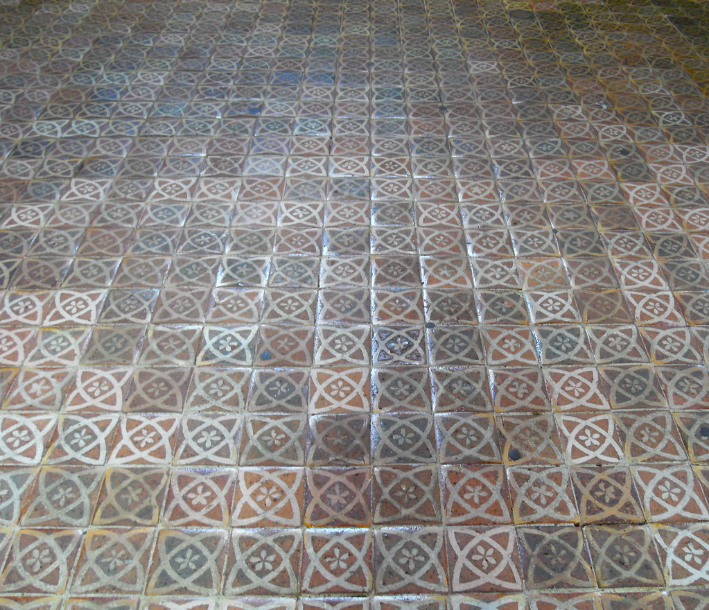
In a later iteration of Exanima with art asset tweaks, and particularly in SG, what I'd like to see is the AD take a much more daring willingness to use colour - pottery on shelves not of mud-brown, but of bone-white, with glossy copper-green glazes on the tops of mugs. Tapestries on the walls. Bright ochre and blue-glaze tiles on floors, whitewashed walls, chairs and trestle tables painted red and blue. I'd like to see the creation of environment models depicting shafts cut into the ceilings of chambers, bright light streaming down forming Crepuscular rays (AKA God's Fingers) in the dusty gloom - it doesn't need volumetric lighting in the engine to be able to easily fake the effect in the environment. Make the place come alive with colour, to contrast those darkest areas, and it will enhance the ambience of the setting greatly. The game will benefit, it will no longer feel dreary, and it will entice players forward. and that can be used to also make areas darker, more forbidding, and in turn, make the settings more atmospheric.
At the moment, the lighting system feels badly under-exploited. You have a real gem of a game engine, that you could use to really play to its strengths - and currently, its being wasted in Exanima.
Your art director, and conceptual artists need, to be blunt, a shot in the arm, to have the willingness and the conviction to push the boundaries of the setting, instead of timidly repeating the same dull tropes. What you have has great potential.
(7b) Dynamic lighting:Object: Candlestick
Object: Fireplace
New Object: Flint and steel?
New Object: Lantern
New Object: Lantern Shield
I would love to see the ability to manipulate the environment's lighting become something that the player can do, following everything that's been said about colour palettes and adding life to the environment art in-game.
Imagine lighting up torches which were left on the wall, or to set a fire burning in the fireplace (with appropriate foley effects for the ambient noise of course), and to use a flint and steel inventory item, or a burning torch to light the candles, and for a dark, dismal area to be filled with light, the colour palette to start to shift from cold blues to warm oranges, and for a place to start to feel safe.
That's the sort of game play that lets players explore and change their environment, and also becomes a reward element.
Ideally, I'd like to see a flint and steel in-game that can create fire for that purpose - it becomes one of those items which the player will cling to, something that keeps back the darkness.
Even better would be for light to be able to become a weapon - by it driving creatures back, making them more hesitant if they break into a now brightly-lit area, and in that way, giving the player not just the sense of security, but also opening up tactical options for combat, to draw an opponent into the light, disorienting them, and giving the advantage to the player. Better still from an environment art point of view, that lets you further emphasise the threat and desolation of the unexplored and hostile areas of the game environment, to the safe and secure.
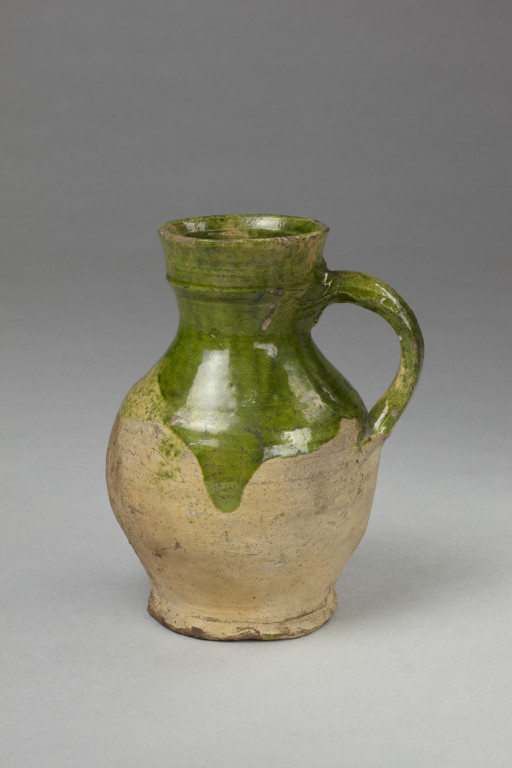
Ideally, for game elements, I would also love to see the creation of a Lantern Shield object - particularly appropriate in more renaissance-styled elements of the setting (the redhead with sword and shield in the arena makes me think of the renaissance era rondelero duellists, and for that sort of style, the lantern shield would fit right in) - and as this surviving example shows, its exactly what the name suggests - a shield with built-in lantern - perfect for exploring darkened places. (their original purpose was for watchmen in cities at night.)
Also, returning for a moment to point 7 on colour and overall art direction of the palette, note the decoration!
If that's not screaming to be used to light the darkness, and to dazzle and disorient the creatures down there, what is?
(8) Navigation
While the compass helps, its still far, far too easy to get lost in-game, or to find yourself going in a circle. it can be rather fun taking it very, very slow, and carefully drawing out every single room, mapping where the doors are, which way they open, annotating it all onto a huge sheet of paper on the table beside me. That is definitely not most people's idea of fun, however. What's needed is some sort of mapping system, that will reveal a map. (ideally, eventually, I'd hope that we have the inventory, a journal, and maps at the least.)
I'm inclined to suggest that the map requires the player to find blank paper, and charcoal.
I'd also suggest that areas of levels should have maps already drawn, for the player to find and to enlarge their existing maps through such finds.
Ideally, I'd like to see those represented a fairly simple line drawings in-game, not some perfect virtual overlay like many games do - just enough to let the player follow the twists and turns, but not marking enough that its leading them by the hand - doing so gives players incentives to make their own maps, if they want to, but also means they at least have something pre-generated by them.
What's badly needed in this regard are more unique landmarks in the way of art assets - the table with a map spread out on it in the second level, the exit from a corridor to find a large open space with archways, with two antechambers on each side, in the first level. Things like that become distinctive points of navigation that are recognised, and should be encouraged, with more details like floor mosaics, rarely used, distinctive set-dressing, and similar art assets, or strong lighting areas.
Its very easy to get confused if this is badly lit Corridor A, or Badly lit Corridor F.
One thing I'd love to see there for navigation is chalk, and the ability to make a mark (simple transparency layer placed on the ground) with an arrow or the likes. The other thing for navigation I've never seen in a game is a ball of string.... tie it to a point, and you get a bright line of string overlays over the tiles between your start point and your current position, up to a certain length - 100 paces (about 20 small cube rooms long) or something.
9: UI graphic design
I personally feel that with the overall palette of the environment, the general UI scheme needs a lot of work. The grey, square-edged boxes of the inventory, the colour scheme of the intro pages and character creation are horribly unsuited to the style of the game, and they contribute to dragging the game down into the doldrums.
Exanima and SG are meant to be a fantastical, somewhat medieval world, but the interface doesn't say that at all. It feels like the interface I'd expect to see in a cold, post-modern cyberpunk setting. Nothing about the user interface elements say "fantasy world" to me. there's no decoration, no details in the borders, no colours or texture that convey a language of visualisation to me. if its medieval, it screams out to have the character generation pages on either side of the avatar be in bright vellum, bordered with carved stonework - high pointed English Perpendicular tracery, or heavy Norman arches, Multicoloured red sandstone and white limestone chequers of Byzantine pillars, or painted polychrome wood. Not cold, square-edged grey Windows. And currently, for new customers, that first view of the character creation is their very first impression. and its not the fantasy world of vivid life and colour and vibrancy. Its the sterile grey of an accountant's office. And that first impression is dull. the screen is dark and gloomy, and there's nothing that hints of imagination in there. Its a marketing nightmare.
That desperately needs work, as does the inventory system, to start to create some sort of feel for the setting. The graphic design chosen there needs to have some sort of counterpoint to the current art direction's dearth of colour. And with Exanima now in public, for the Early Access, that absence of any flair or life to the UI is visible to the public as a whole. and its simply not good enough for that all-important first impression.
(9b) First impressions:
Tutorial, interaction etc.
There's dire need of a very basic tutorial at least, for the same reasons as the first impression of the overall graphic design of the UI - commentary I've read like "took 10 mins to open the first door" is commonplace, and its that sort of thing that will result in a lot of players quitting right away, and giving negative feedback to their friends, the sort of word-of-mouth impression that will scupper sales rapidly.
I personally feel that a number of guidelines need to be come up on-screen at the start of the game playthrough (you can have an option tickybox for "disable starting hints" for the ultra hardcore types), as subtle introductions.
Personally, I would be inclined to expand the opening room with the addition of another small anteroom that the player wakes up in, with the door ajar, the torch on the floor, and more importantly, a brighter light (a skylight, or similar) in the main room, the door out from the room locked, and a table or desk with a key on it, in the light. The light serves to stream through to the player through the open door, giving them a clear first direction to aim for.
That slightly open door is a quick, effective way to let the player see how the mouse-over action interacts with the door (and in turn, teaches the player instantly that the mouse-over interacts with other items). Because its a door that's a little open, even if they click and drag it the wrong way, and it gets pulled closed, they see that is moves, so they can figure out that it was pushed not pulled, and they can try the other way. This prevents the player from getting immediately lost, pushing on a door that only moves by pulling, and concluding that they're not doing any action.
The key on the table is well-lit, making it easy to spot. It teaches them that they need to look for detailed objects, as well as large items. the immediate access to a key and the only doorway for progress being locked, shows them how to use double-click and an action to do things like unlock doors.
And of course, its dark in the hallway, so they realise that they need light - so if they failed to collect the torch, its close enough to their start point that they should remember its there.
In that way, with a simple addition of a few elements, with a subtle series of guidance pointers that come up as items are collected along the path to opening that door, you've got the basic tutorial that serves to show players the fundamental control elements without it being intrusive. That's what's needed to give completely new players a very simple grounding in how the game works, and the core mechanics.
(10) Combat controls.
Kinematics in the body need so much work, that that's going to be a post far, far longer than this one.
but its the big first impression problem that I steel feel needs addressed in a constructive but critical way.
I honestly believe that there are ways to make combat much more direct and intuitive, without dumbing it down. I also am firmly of the opinion that as it is, it is both the best unique selling point of the game, and its biggest problem which will drive customers away. So I'll leave it at that and put that into a bigger post, later on. Someday. when the stars are right.
---
Erm. Ok, that was a longer post than I planned.
I hope some of those make sense for the important elements of design, first impressions, and generally, for improving the way the game can play, without compromising
Last edited:
")